In an era marked by rapid change, businesses are actively seeking ways to adapt to evolving consumer tastes. From pioneering product launches to cutting-edge brand revamps, companies are embracing experimentation like never before.
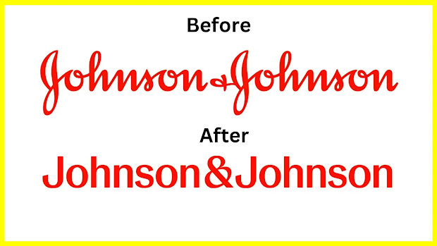
Embracing this innovative spirit, the world's foremost healthcare juggernaut, Johnson & Johnson, bids farewell to its iconic 1887 logo and welcomes a sleek, futuristic emblem as its new face.
Additionally, the company has opted to consolidate its diverse ventures under the unified banner of Johnson & Johnson. CEO Joaquin Duato took to his LinkedIn account to announce this momentous transition.
While the original logo will endure on consumer favorites like Kenvue's baby shampoo (following its recent separation from J&J), this transformation signifies Johnson & Johnson's strategic shift towards a heightened focus on pharmaceuticals and medical devices.
The revamped visual identity is poised to be a linchpin in driving this pivotal transformation.
In an age where change is constant, businesses find themselves in a perpetual race to meet the evolving expectations of their customer base.
Johnson & Johnson, a stalwart in the healthcare industry, has always been attuned to these shifts.
This time, the company is making waves with a bold decision to overhaul its iconic logo, a symbol that has graced its brand for over a century.
The new logo unveiled by Johnson & Johnson encapsulates a futuristic vision that reflects the company's commitment to staying ahead of the curve.
It's a departure from tradition, signaling a progressive approach that mirrors the ever-changing world of healthcare.
With sleek lines and contemporary design elements, the logo embodies the forward-thinking ethos that defines Johnson & Johnson's mission in the modern age.
In addition to the logo revamp, Johnson & Johnson has chosen to consolidate its various businesses under a single, cohesive brand name: Johnson & Johnson.
This strategic move streamlines the company's diverse ventures, presenting a unified front to the world. It's a testament to the company's determination to remain agile and adaptable in a dynamic market.
While Johnson & Johnson embarks on this transformative journey, some things will remain constant.
The original logo will continue to grace consumer staples such as Kenvue's beloved baby shampoo.
This decision preserves a link to the past even as the company propels itself into an innovative future.
As Johnson & Johnson sets its sights on a greater focus on pharmaceuticals and medical devices, the new logo assumes a critical role in this strategic pivot.
It serves as a symbol of the company's commitment to pioneering healthcare solutions, and its dedication to shaping the future of the industry.
In a world marked by rapid change, Johnson & Johnson's bold decision to reinvent its logo and consolidate its brand identity signals a forward-looking approach.
The healthcare giant is not merely adapting to change; it's embracing it. As the company evolves, its new logo will stand as a beacon of innovation and progress in the field of healthcare.


0 Comments